Main Dashboard Layout
This dashboard provides an overview of operational and clinical metrics to monitor the performance and efficiency of patient handling and service delivery.
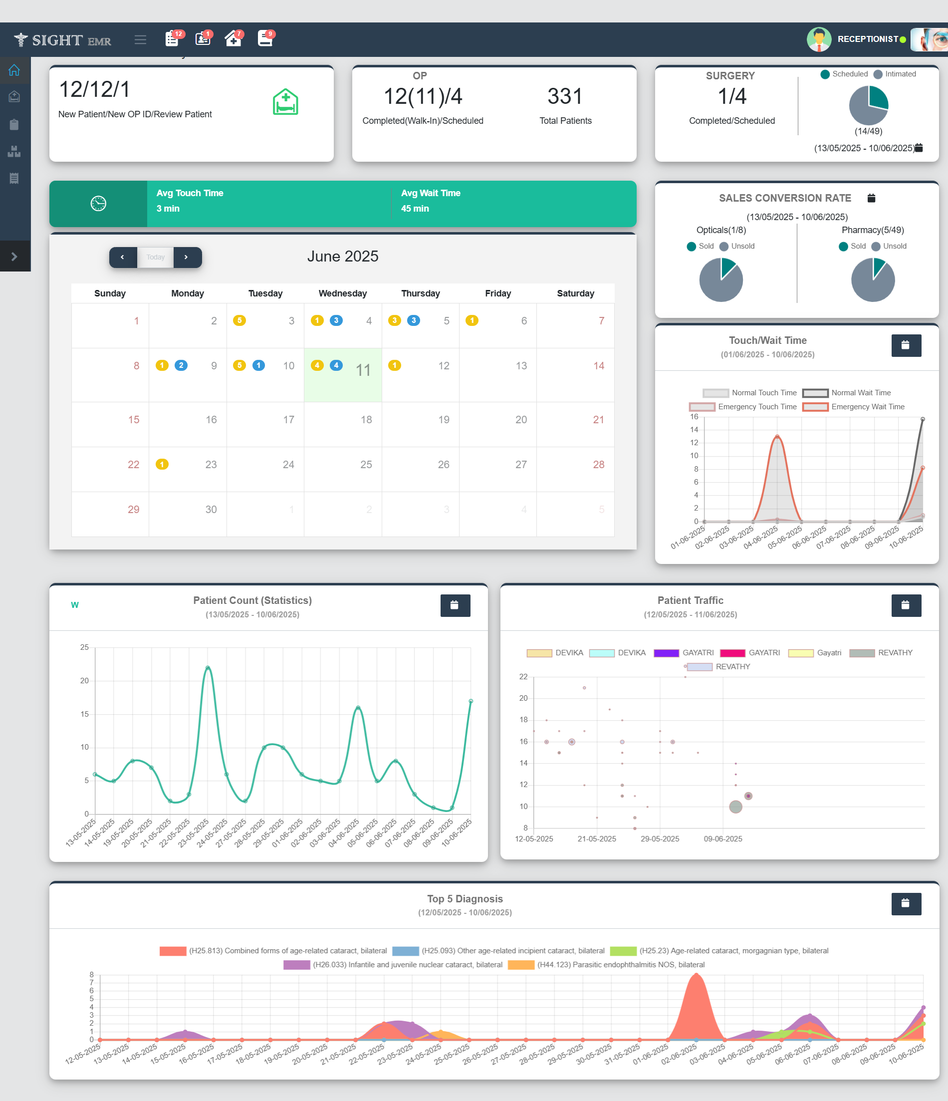
Patient Summary Panel (Top-Left)
- New Patient / New OP ID / Review Patient: Displays the count of each category for the current date.
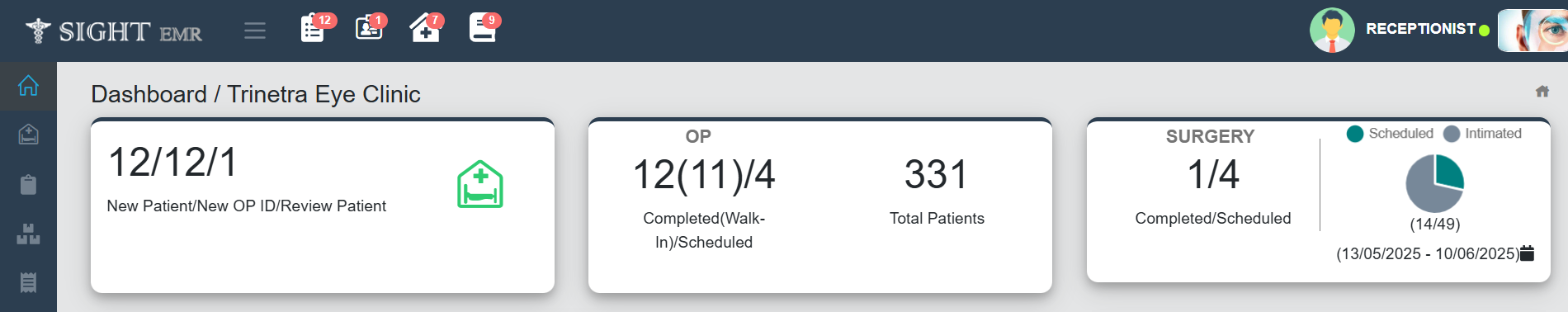
OP Summary Panel (Top-Center)
- Completed (Walk-In) / Scheduled: Shows number of completed (Walk-in) and Number of scheduled patients for the current date.
- Total Patients: Total number of patients handled to date.
Surgery Panel (Top-Right)
- Completed / Scheduled Surgeries: Displays current surgical status (Completed Surgeriesand scheduled surgeries for the current date).
- Pie Chart: Date wise Visual representation of the Surgery Scheduled (Scheduled in Green colour, Intimated in Grey colour).
Touch and Wait Time (Middle Panel)

- Avg Touch Time: Average interaction time with patients (Time from Pick to Submit).
- Avg Wait Time: Average waiting time before service (time before pick).
Calendar View (Center)
- Month View: Displays daily patient interactions or events.
- Colored dots with numbers:
- Yellow: Scheduled Count
- Blue: Surgery Scheduled Count
- Colored dots with numbers:
- Navigation: To move across months.
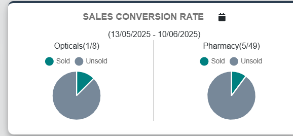
Sales Conversion Rate (Right-Center)
- Pie Chart: Date wise Visual summary of sales performance of Opticals and Pharmacy (Sold and Unsold count).