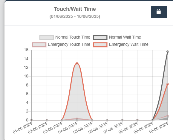
Touch Time and Wait Time
- Can Select date range from Date picker or preset options on the left like Yesterday, Last 7 days, Last 30 days, This Month.
- Click Apply button to view the changes.
- This line graph displays the Normal Touch Time, Normal Wait Time, Emergency Touch Time, Emergency Wait Time.
- X-axis: Dates
- Y-axis: Time
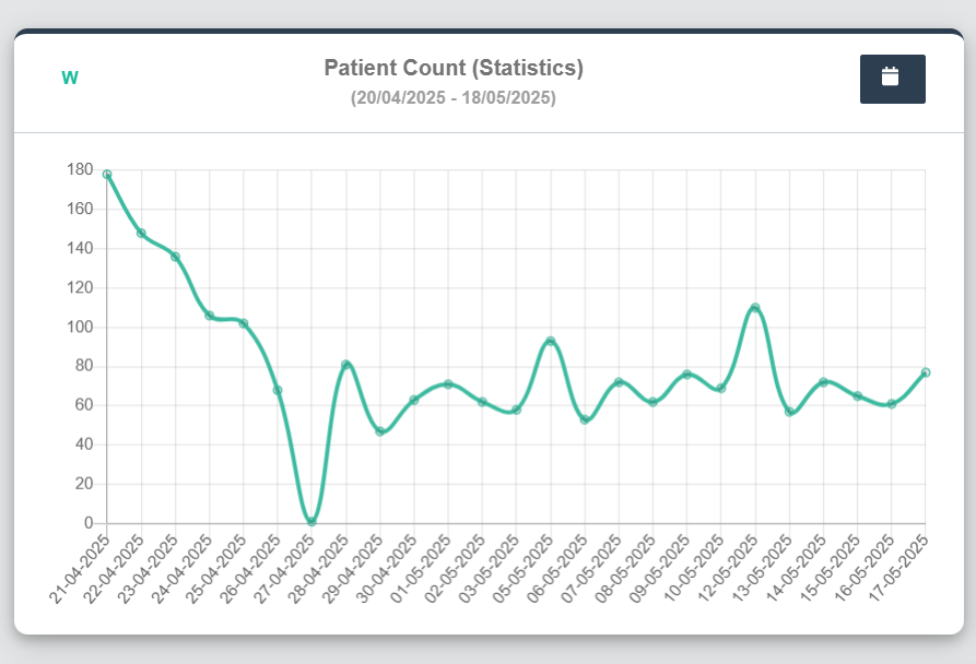
Patient Count (Statistics) :Bottom Left of the Dashboard
- Can Select date range from Date picker or preset options on the left like Yesterday, Last 7 days, Last 30 days, This Month.
- Click Apply button to view the changes.
- This line graph displays the total number of patients visiting the clinic across the selected date range.
- X-axis: Dates
- Y-axis: Number of Patients
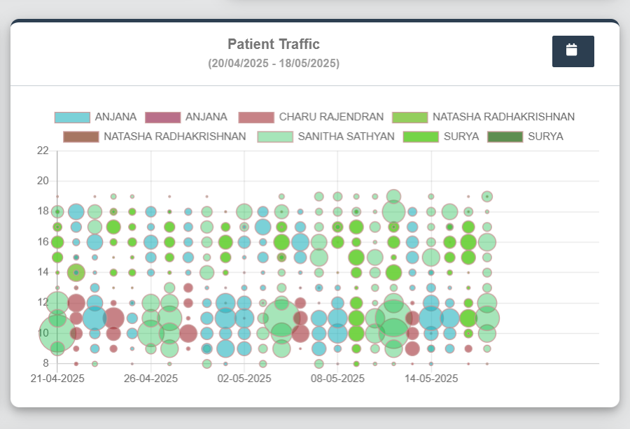
Patient Traffic - Bubble Graph (By Doctor): Bottom right of the Dashboard
-
- Can Select date range from Date picker or preset options on the left like Yesterday, Last 7 days, Last 30 days, This Month.
- Click Apply button to view the changes.
- X-axis: Dates
- Y-axis: Number of Patients
- Separate color codes are used to distinguish between entries by the same or different Doctors.
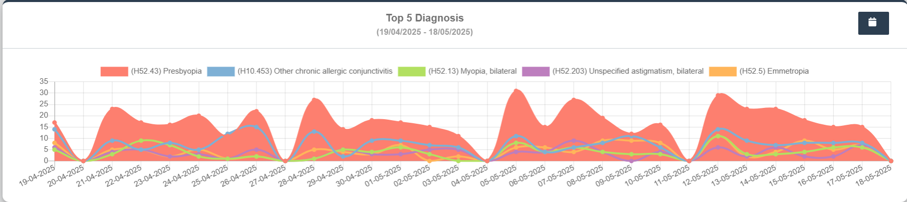
Top 5 Diagnosis: Bottom Wide Panel
- This area chart visualizes the frequency of top 5 diagnoses recorded in the clinic over a period
- Can Select date range from Date picker or preset options on the left like Yesterday, Last 7 days, Last 30 days, This Month.
- Click Apply button to view the changes.
- X-axis: Dates
- Y-axis: Number of Diagnosis Occurrences
- Peaks indicate diagnostic spikes on certain days.
- Separate color codes are used to distinguish the Diagnosis.